Hi Friends,
Since the beginning of 2012 I had been talking about the forthcoming Crash in U.S. Equities & now it seems like the so called most awaited Mayhem has Started. Today I'm posting the Real Long term Picture of Dow Jones Industrial Average & thesis behind the so called Crash.
History Of Dow Jones & Super Cycle:-
The above chart by EWI shows the Super Cycle of DJIA & History of Presidential Election. So far only 1 Incumbent had been Re-elected during Major Bear Market Rallies in DJIA. Obama is the 2nd Incumbent who is Re-elected. The EWI Research shows that the Incumbent has more chance of getting re-elected during who's Tenure Stock Market Rallied. So Obama's Re-election was an expected outcome. However, the main point here is Investors must not forget the History. Dow History shows that all Major Bear Market Rallies witnessed the Bust in later period.
A Complex Corrective Rally:-
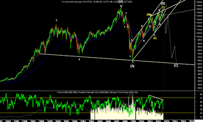
On a Weekly chart we can clearly see a 5 Wave Decline from 2008 Top which could be marked as either Wave A or 1. And the 43 months Rally from 2009 lows is a clear Complex Corrective. This Rally doesn't satisfy a single Criteria for Directional Move. The Waves are overlapping & there is no Faster Retracement of 2008 Fall. Hence, the Rally is but obvious Corrective in Nature. We can also see momentum loosing which is evident from Huge RSI Negative Divergence & Decline in Volumes.
Short Term Picture:-
On Daily Chart we can now see a clear Impulsive Fall from Oct High. The Market is oversold & hence a bounce back in wave (iv) is expected. Major support is around 12120 where I expect Wave 1 to complete. The Year End Rally in Corrective Wave 2 up shall be used to Exit Longs.
Alternatively there could be another (X) & (Z) Waves & DJIA may make a New High. However, Investors must use the Year End Rally to Exit Longs. As much larger Crash is expected in 2013.
Sentiment Indicator:-
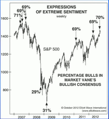
The above chart shows the % of Bulls in Market. And as usual the consensus depicts the extreme expression of optimism right at Top. Which has extremely Bearish implications as suggested by the History.
The Comparison of CBOE VIX & S&P 500 is another Indicator that seeks attention. The low VIX readings have much Bearish implications on Indices. The mild push in VIX suggest that Investors have not yet Panicked by current fall & thinking this is just a Correction in Ongoing Bull Market. The current picture is reminiscent of what happened in early 2008. The above 2 charts give early warning to Investors of a forthcoming Crash.
Mutual Fund Cash Levels:-
The Stock Market needs Cash to Fuel a Rally. The above chart shows Mutual Fund Cash Levels vs. the S&P 500 from 1968. The History shows that Stock Market Rallied when Mutual Fund Cash Levels were at Record Highs & Sold off when Cash Levels were at Record Lows.
Since the beginning of 2012 I had been talking about the forthcoming Crash in U.S. Equities & now it seems like the so called most awaited Mayhem has Started. Today I'm posting the Real Long term Picture of Dow Jones Industrial Average & thesis behind the so called Crash.
History Of Dow Jones & Super Cycle:-
 |
| Source:- http://www.elliottwave.com/ |
The above chart by EWI shows the Super Cycle of DJIA & History of Presidential Election. So far only 1 Incumbent had been Re-elected during Major Bear Market Rallies in DJIA. Obama is the 2nd Incumbent who is Re-elected. The EWI Research shows that the Incumbent has more chance of getting re-elected during who's Tenure Stock Market Rallied. So Obama's Re-election was an expected outcome. However, the main point here is Investors must not forget the History. Dow History shows that all Major Bear Market Rallies witnessed the Bust in later period.
A Complex Corrective Rally:-
 |
| DJIA - Weekly |
On a Weekly chart we can clearly see a 5 Wave Decline from 2008 Top which could be marked as either Wave A or 1. And the 43 months Rally from 2009 lows is a clear Complex Corrective. This Rally doesn't satisfy a single Criteria for Directional Move. The Waves are overlapping & there is no Faster Retracement of 2008 Fall. Hence, the Rally is but obvious Corrective in Nature. We can also see momentum loosing which is evident from Huge RSI Negative Divergence & Decline in Volumes.
Short Term Picture:-
 |
| DJIA - Daily |
On Daily Chart we can now see a clear Impulsive Fall from Oct High. The Market is oversold & hence a bounce back in wave (iv) is expected. Major support is around 12120 where I expect Wave 1 to complete. The Year End Rally in Corrective Wave 2 up shall be used to Exit Longs.
Alternatively there could be another (X) & (Z) Waves & DJIA may make a New High. However, Investors must use the Year End Rally to Exit Longs. As much larger Crash is expected in 2013.
Sentiment Indicator:-
 |
| Source:- http://www.elliottwave.com/ |
The above chart shows the % of Bulls in Market. And as usual the consensus depicts the extreme expression of optimism right at Top. Which has extremely Bearish implications as suggested by the History.
.bmp) |
| Source:- http://www.elliottwave.com/ |
The Comparison of CBOE VIX & S&P 500 is another Indicator that seeks attention. The low VIX readings have much Bearish implications on Indices. The mild push in VIX suggest that Investors have not yet Panicked by current fall & thinking this is just a Correction in Ongoing Bull Market. The current picture is reminiscent of what happened in early 2008. The above 2 charts give early warning to Investors of a forthcoming Crash.
Mutual Fund Cash Levels:-
 |
| U.S. Mutual Fund Cash Levels vs. S&P 500 |
The Stock Market needs Cash to Fuel a Rally. The above chart shows Mutual Fund Cash Levels vs. the S&P 500 from 1968. The History shows that Stock Market Rallied when Mutual Fund Cash Levels were at Record Highs & Sold off when Cash Levels were at Record Lows.
Cash levels have been in a range of 3.4% - 3.8% since July 2010 as
Stock prices have continued to Rise. This is quite different from prior
history and is evidence of the Fed propping up the Market. This cannot continue
indefinitely & Market is facing a long decline similar
to 2000-2002 and 2007-2009 (40-60%).
In short we must listen to the signals given by Market and don't presume that Government Agencies will Protect our Finances.
Thanks & Regards,
Harsh Dixit.
Keep up your good work..Impressed bigtime..
ReplyDeleteBest Regards,
Ramesh Chordia.
harsh pl make a analysis chart of nifty for 2013 lots of people will get benefit of your knowledge
ReplyDeleteatul
Hi Atul,
ReplyDeleteI will surely update my views on Nifty for 2013 soon..
Thanks & Regards,
Harsh Dixit.
Let's not forget economics are getting better and yes we must be aware of when the fed pulls outwe can still make money in the right stocks.ever the bull!
ReplyDelete